Pages

Saturday 26 May 2012

Shabby Chic Mini Book Page - for May


This is my page for the challenge being hosted by Renee
over on The Artists' Nest Ning site. 
 
This month's theme is
'French Inspired'.
Like my other pages, this measures approx
3" x 5" and is largely fabric apart from the 
card base and the piece of old French text. 

I traced the Eiffel Tower onto tracing paper
and machined stitched it onto the base of the page
then ripped the paper off.
A French postage stamp and piece of old lace
finished it off. 
 
 I actually prefer the other side!


.... so it's a reversible page - well only if my swap partner
likes it too of course!!

Thanks for looking and I hope you enjoy the weekend :)

Friday 25 May 2012

Recent makes

Here are some things I've made recently


 This is an Anniversary card using the
'Vintage Telephone'
Bigz die by Tim Holtz/Alterations/Sizzix.


It's cut from mountboard and coloured with Distress Inks
before that I applied Distress Crackle paint (Clear Rock Candy).
The centre dial is just coloured with a gold marker.


The tag attached to the phone is from
'Odds and Ends CMS100'
stamp by Stampers Anonymous - Tim Holtz Collection.
It shows the date and the month of the anniversary.


I used the 'Vintage Typewriter' Bigz die
(Tim Holtz/Alterations/Sizzix)
for this birthday card.


It's basically a feminine version of the card
I made the other week.


Another birthday card, this time using an 'On The Edge'
die by Tim Holtz/Alterations/Sizzix called 'Sewing Edge'
 I rubber stamped some images onto tissue paper,
then using Liquitex matte medium stuck them onto
some patterned tissue paper.
The stamps used were 'Floral Dress Form' and 'Dress Form Row'
both by B Line Designs.
I machine stitched some fabric around the edge.

I think this may be another favourite die now
(how many favourites can I have - lol)
 

Finally - a matchbox, well I haven't made one for few weeks!
 

It is entirely covered with Sari Ribbons attached using 
hot melt glue, which amazingly doesn't show through the fabric.


 The sides and bottom of the drawer were painted with
Viva Precious Metal Colour (Emerald Green).


.... and filled with a selection of beads.

Thanks for looking - and I hope the sun is shining where you are
- it's been a glorious hot and sunny day here :)

Monday 21 May 2012

Altered Book - next lesson


This post is about my progress in the 
Altered Book course being run (free of charge) by
the very generous Elizabeth from her blog
 
 
This lesson was all about 
'Elements of Design'  
which Elizabeth explored in great detail.
The elements in question are
 
Line
Form
Shape
Space
Texture
Colour
 
In the double spread in my book (above) I hope I've
covered some of the elements as follows:
 
Line - in the tissue pattern paper on the first page
 
Form / Shape -  I tried to create a 3D effect on the second page
with the girls by overlapping the images and colouring the front
one darker than the others making them fade out into the background.


Texture - the crinkles in the pattern tissue paper
 which you can see in the above photo.
  I highlighted them by rubbing metallic
paste over the page.

Space - well, there's plenty of that - the eyes can
positively have a good long sleep on these pages - lol.

Colour - as this is such a 'broad category' Elizabeth has
devoted an entire lesson to it and that lesson is already
on Elizabeth's blog - I'd better get a move on!

Thanks for looking :)

Sunday 13 May 2012

A Compendium of Curiosities - Challenge No. 5 - Shattered Stains


I'm following the challenges being set by the lovely Linda
on her blog Studio L3 working from Tim Holtz' new book
A Compendium of Curiosities Volume II.
This week's challenge was to follow the
 'Shattered Stains'
 technique on page 48 of the book. 
 
(Simon Says Stamp will be giving a $25 gift certificate to one lucky,
 randomly-selected participant in this week's challenge!)
 
Here's what I used
 
 
The Distress Crackle Paint I used was actually 
Clear Rock Candy and not Picket Fence -
I'm not sure how that got into the photo!
The little bottle at the end is a clear nail varnish.
 
I used Tim Holtz/Alterations Sizzix Bigz die
'Vintage Typewriter'


The crackle paint gave a lovely texture, I didn't think
I'd used a thick enough layer, but was pleased with the result.
I painted over it all with the clear nail varnish to give
it more of a shine.

I stuck the vintage typewriter onto a card
to make a birthday card for my brother in law.
By using the slot along the top of the typewriter
you can make a personalised message emerging from it!


I really love this typewriter die,
and think I'll be using it quite a lot from now on!

Thanks for looking :)

Wednesday 9 May 2012

What's On Your Workdesk? Wednesday week 153


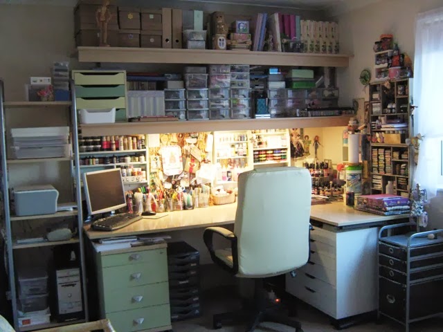
Hello, hello, want to see what's on my desk today?


This lot arrived in the post today from the lovely
Cindy from America.
We did a one to one Spring/Bird charm swap
(using a game piece) and as well as her bird charm,
she sent another cityscape charm and two stamp sets! 
How lucky am I!
Thank you so much Cindy, you're the best!

I also received this in the post today


This came from Jo in Canada and is a page for my
Shabby Chic mini book - for April the theme was 'Wings'.
It's so arty, I love it! 

I had another packet in the post too (what a great post day!)


These were from QVC - Lindsay Mason stamps,
I couldn't resist these images when I saw them on TV
last week.

I've been shopping this morning and a new shop has
opened in the local shopping mall called
As more and more shops are closing in the high streets thesedays, 
it's lovely to have something new and different to look around.
The shop was really busy and I hope it does well.

Here's what I bought in there


The hand is made from clay and covered in black flock fabric
 It was only £2 and will be great for photographing small items on.
The pack of beads I really didn't need, but as they were stored
in eight little glass bottles, I couldn't resist them (£3)!
The harlequin square is a ceramic coaster tile - which I thought would
look nice in my craft room and could be used with my heat gun
to protect my table (£1).
Towards the back the four coloured dishes are plastic 'Desk Pots'
and they sit on their own plastic base tray.  I don't know what I'm 
going to use them for yet, but they were only £2! 
The red circle is a pack of four 'twist off' anti slip mats
(I've been looking for something like these for a while - 
some of my Dylusion paint pots are a bit clogged around the rim
 and are really difficult to open.)
 These twist offs also have a great texture to them
 so great for dipping in paint and making a mess! (£1).
Finally, there's a pack of 12 sheets of Origami paper (£1).

Well that's about it for me.
I haven't got any work in progress to show at the moment,
although I do have a list of family birthday cards to make,
so maybe I can use some of my new purchases for them.

If you'd like to see what's on other desks -
hop on over to Julia's blog
you won't be disappointed I promise!

Thanks for coming to see mine this week :) 
 

Sunday 6 May 2012

A Compendium of Curiosities - Challenge No. 4 - Faded Layers


I'm following the challenges being set by the lovely Linda
on her blog Studio L3 working from Tim Holtz' new book
A Compendium of Curiosities Volume II.
This week's challenge was to follow the technique
on page 43 and create something making 'Faded Layers'.
Here's what I used to make mine

I followed the technique to make the tag.
For the background card, I just wiped some Distress Ink
onto the craft sheet, spritzed with water
and swiped the card over it a few times -
then used a mask and inked over that. 
 I made it into a card.


I never like making cards, so by following Linda's
challenges I can mount whatever I make onto
a card - result!

Thanks for looking :)

Saturday 5 May 2012

My Altered Book - next steps


Firstly, I'd like to say thank you for being here -
even though you saw the awful page above, you still came!

This post is about my progress in the 
Altered Book course being run (free of charge) by
the very generous Elizabeth from her blog


This lesson was about 'Design Principles' (part one).
Elizabeth wrote an epic post all about this with
brilliant examples to demonstrate the principles.

The areas covered were
Harmony, Unity, Balance and
Proportion and Emphasis

After studying Elizabeth's post, taking notes,
thinking about it all - the above is what I came up with!

The pages were progressing ok, but I just over did it I think!
No gold star for me - lol.
At least I have the main principles rubber stamped onto
the pages, so that's a good reminder if nothing else.


Moving swiftly on, this next lesson was the
second part of 'Design Principles'.


This lesson covered
Rhythm or Pattern,
Movement,
Repetition
Contrast,
Dominance

I'm pleased with this spread and think I've covered
some of the elements.

The fabric flowing from the sewing machine -
movement, it also creates a pattern and is dominant?
(I used sticky dots here and there to stick it onto the page)

The various tape measures and numbers provide the repetition,
and the pattern covers on the facing page - and also the buttons
too I suppose.

The black buttons are a contrast to the rest of the light colours.


I made the mistake of trying to sew the buttons onto the pages,
but they were far too fragile for that,
so the sticky dots came to rescue again! 

I used the same wide ribbon on this page as I used
for the closure around the book, although I'll probably add
some colour to the outside ribbon once the book is finished.

 
I'd like to say the flowing fabric idea was mine,
 but it was actually from a round robin journal page 
I received a few years back from the wonderfully talented
 and I blatantly copied it took inspiration from it!

Lesson 7 is now available from Elizabeth's blog
and I see it's about 'Elements of Design'
 - another big gulp from me!!!
 
Thanks for looking :)


Friday 4 May 2012

Spring Bird Charm Swap


A little matchbox covered with a napkin and decorated
with a metal bird charm - for a one to one swap with
Cindy - who's crafty and makes things too!


The swap was for a Spring Bird Charm
and it had to contain a game piece.

I used a jigsaw puzzle piece


I also made a card


Using some of the same napkin 
as the matchbox was covered in.

The stamps are Tim Holtz and coloured with
Distress Ink Marker pens spritzed before stamping with water.

I wish it felt like it was Spring here 
instead of being cold and wet all the time.

Roll on the Bank Holiday weekend - umbrellas at the ready!!