Pages

Friday 25 July 2014

School Holiday Fun - More Post-It-Note Books


Earlier this week my niece and nephew came
to play in my craft room - yay!!!

Whenever I can't think of what craft to actually do,
the Big Shot embossing machine usually comes
to the rescue.

So we made Post-It-Note covers - based on 
Tim Holtz 'painted industrial' technique as
described in the post below.

Chloe's book is on the left - and instead of using
paint to colour her cover, she used alcohol inks.
She decided to tie some gold coloured fibres around it too.

Aaron used black paint on his and added a couple of
little bulldog clips.

Didn't they do well!
Here they are with their finished items.


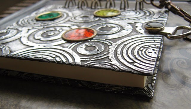
I only finished my one today, and I used 
alcohol inks too


It was looking quite opulent and exotic so I
added some self adhesive rhinestones and a tassle.


Now I had better get my thinking cap on
for when they next visit .....
watch this space!

Thanks for looking :)

Sunday 20 July 2014

Compendium of Curiosities III - Challenge 7


The current challenge on Linda Ledbetter's blog,
is to make something using the technique called
"Painted Industrial"
as described in Tim Holtz' book -
A Compendium of Curiosities Volume III.
(page 46).

I like this technique as it's quick and easy with
good results.

I decided to make a post it note holder and
decorate the covers using this technique.


The covers were cut from mountboard.


 I didn't have any black Distress Paint but
Claudine Hellmuth's Studio paint seemed to work just as well.


I decorated the inside covers too.


 ..... and the back.


I added a few embellishments too.
I love the deep embossing and think it really does
have the look of 'painted industrial'.

There are some prizes on offer if you enter
this challenge and are a lucky winner -

are offering a $50 Gift Certificate (wow!)

and one lucky winner will receive a spectacular assortment
 of Tim Holtz products, courtesy of Tim himself 
and Mario Rossi, his business manager.  (double wow!!)

What you waiting for!!!

Thanks for looking at my entry:)

More Cat Photos

I've just put a photo on the post below
of Leo enjoying the garden, here's some more.


No one will see me hiding in here!


Or here!


I'm a bit thirsty!


Hello Lily, are you thirsty too?


 Kissy kissy!

Silent Sunday


http://www.cosmicgirlie.com/2014/07/20/silent-sunday-71/

Sunday 13 July 2014

That's Crafty! Challenge: Masks, Templates or Stencils


The current challenge over on the
is to use masks, templates or stencils
(or all three) in your project.

I started off with good intentions gathering
everything I needed.
I used my paper doll template and dabbed and
sprayed paints and inks around it.
I also used all of the stencils above although
they don't show in the finished project!

I didn't like it and it was destined for the rubbish bin.
However, I drew around the edges and coloured
it in a bit - deliberately clashing the colours,
and think it's just about acceptable.


I layered it onto black card, added some
fibres and it's now a bookmark.
(I probably shouldn't have photographed it
on the blue background, but it's done now!)

Thanks for looking
 (and for listening to my moaning - lol)

Silent Sunday


http://www.cosmicgirlie.com/silent-sunday/

Saturday 5 July 2014

Tim Holtz: 12 Tags of 2014 - July

DSC00428 
 Tim's tag for July is above -
If you want to see how he made it,
click on the picture to go to his blog.
 
..... and here's my version
 
 
When I first saw Tim's tag for this month it didn't
immediately fill me with joy but working through his
tutorial covered so many different techniques,
it's turned out to be one of my favourites so far!
 
I didn't have the Sizzix die for the sea horse and
sand dollar so I cut my own - that's why the star
shape looks a bit weird.
 
The pictures which follow just show what I used
to do each part.


The best bit - well there's a few really, I liked using
 acetate with an embossing folder to create
a watery background.
 
I loved making the sand - mixing embossing powder,
glitter and crackle accents (should have been glossy accents). 


The sand dollar and star fish turned out really well
too, they have a lovely sandy texture.


I only had pink tones of the Distress Paint so that's why
he's pink!  My rock candy distress crackle paint had
completely dried up, so instead I used Crackle Accents.
I like the grungy-ness of him.

I didn't have one of Tim's word bands so instead
added a few pieces of underwater treasure -
ie, sequins and sequin waste.

 
That's it for this month, looking forward
to the next one already.

Thanks for looking :)